Cinematography School
Theory, technique & visual craft for the independent filmmaker.
CHAPTER FIVE
Color Science & Grading
Color is emotion made visible. Your grade is the last rewrite.
Color Theory
Color in cinema is not about accuracy — it is about feeling. The colors in your frame communicate mood, time, place, and emotional state before the audience consciously processes them.
Warm tones (reds, oranges, yellows) feel inviting, nostalgic, comfortable, or oppressively hot depending on context and intensity. Cool tones (blues, teals, greens) feel detached, clinical, melancholy, or serene. The interplay between warm and cool within a single frame creates visual tension and depth.
Complementary colors sit opposite each other on the color wheel and create maximum contrast when placed together. The orange-teal color grade is the most ubiquitous example in modern cinema: warm skin tones against cool shadows and backgrounds. It works because human skin reads as warm against teal, creating instant separation and visual pop. But it is overused to the point of cliché — be aware of it and make a conscious choice.
Analogous colors (adjacent on the color wheel) create harmony and cohesion. A scene graded entirely in amber and gold tones feels unified and warm. A scene in blues and cyans feels cold but consistent. Monochromatic or near-monochromatic palettes focus the audience’s attention on form, texture, and performance rather than color contrast.
Color Spaces
A color space defines the range (gamut) of colors that can be represented. Understanding color spaces ensures that the colors you see on set translate accurately to the final deliverable.
| Color Space | Gamut | Use |
|---|---|---|
| Rec. 709 | Standard HD | Broadcast, web delivery, most screens |
| Rec. 2020 | Ultra-wide HDR | HDR delivery, streaming platforms |
| DCI-P3 | Wide cinema | Theatrical projection, Apple displays |
| ACES | Scene-referred | VFX pipelines, future-proof archiving |
| S-Gamut / BMD Film | Log capture gamut | Shooting gamut (not for delivery) |
Grade Workflow
Color grading is typically a two-stage process: primary correction and secondary correction.
Primary correction is the first pass where you set the overall exposure, white balance, and contrast for each shot. The goal is to normalize all your footage so that it has consistent brightness, color temperature, and contrast. This is where you correct for any exposure inconsistencies from the shoot and ensure shot-to-shot consistency within a scene.
Secondary correction is where you make targeted adjustments: isolating specific colors (like skin tones or a red dress), creating masks or power windows to affect only parts of the frame, and applying the creative look that defines the film’s visual identity.
LUTs (Look-Up Tables) are mathematical transforms that remap color values. Technical LUTs convert between color spaces (e.g., Log to Rec. 709). Creative LUTs apply a specific look or style. LUTs are starting points, not endpoints — applying a LUT without adjustment rarely produces optimal results.
DaVinci Resolve is the industry-standard grading application and offers a free version with professional-grade tools. Learning Resolve is one of the highest-value investments an independent filmmaker can make. Its node-based grading system, scopes, and color management tools are used on everything from YouTube videos to Hollywood features.
Skin tones should sit on the skin-tone line of the vectorscope. If skin is drifting green or magenta, it reads as sick or alien. Protect skin tones before everything else.
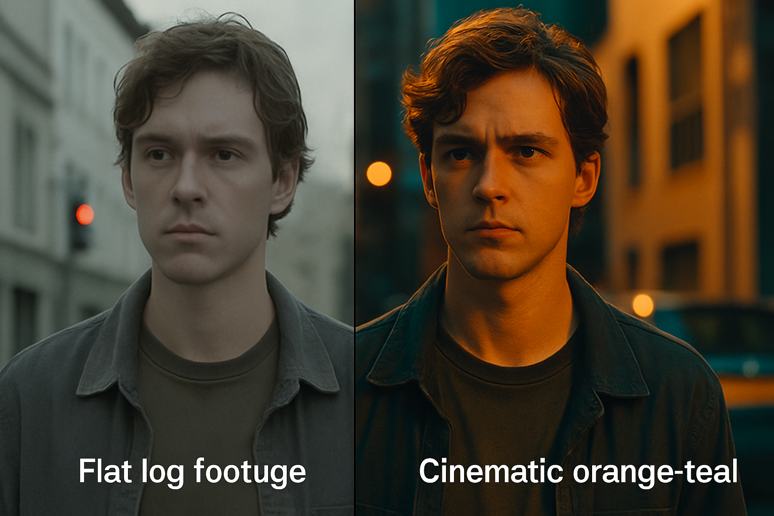
Before/after — flat Log footage vs. orange-teal grade
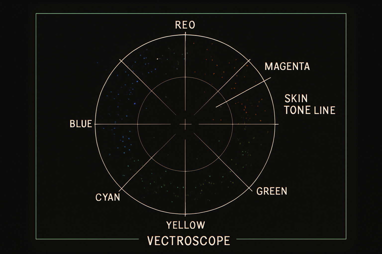
Vectorscope — skin tones sit on the diagonal line